Project 2
Explorite
Overview
Explorite aims to organize event planning all into one app featuring messaging, news about local events, and booking events.
Problem context
People often use multiple apps to plan and organize fun activities near their location or explore the city with friends or family. However, the constant switching between apps and locating information can be a hassle thus deterring people from enjoying social activities.
Role
UX Research
UX Designer
UI Designer
Timeline
November - February 2025
Audience
Working adults
Extroverts
Event planners
Tools
Figma, Miro
ideation
01 - Interviews
Research Problem: Removing obstacles for finding and planning for events such as switching between multiple apps, texting back and forth, and determining availability between attendees.
Enlisting the help of multiple social and news platforms to curate a list of events that can be easily accessed and organized.
Problem Statement: I want to learn what resources people use when finding activities to do nearby.
What apps or websites do you typically use to find fun activities around you?
Roughly explain your thought process behind finding group activities.
02 - Considerations
Option to choose activity or people to invite first
Keeping track of planning progress such as date, time, location, arrival
Search through keywords while offering suggestions related to the participant’s interests and age
Create a scheduling system for everyone to input their availability
Allow location sharing for ETA
Research
01 - Questions
What app(s) do you use to find things to do nearby?
What do you enjoy about using those apps in general?
What are some challenges you encounter when planning a group hangout?
What is your process for organizing group hangouts/activities?
How do you give your friends updates and do you feel that it is effective, if so why? (Whereabouts, changes in plans, etc.)
What are some factors that you consider to ensure compatibility amongst your friend group and a good group dynamic?
02 - Affinity diagram
03 - empathy map
04 - User personas
05 - User journey
Design
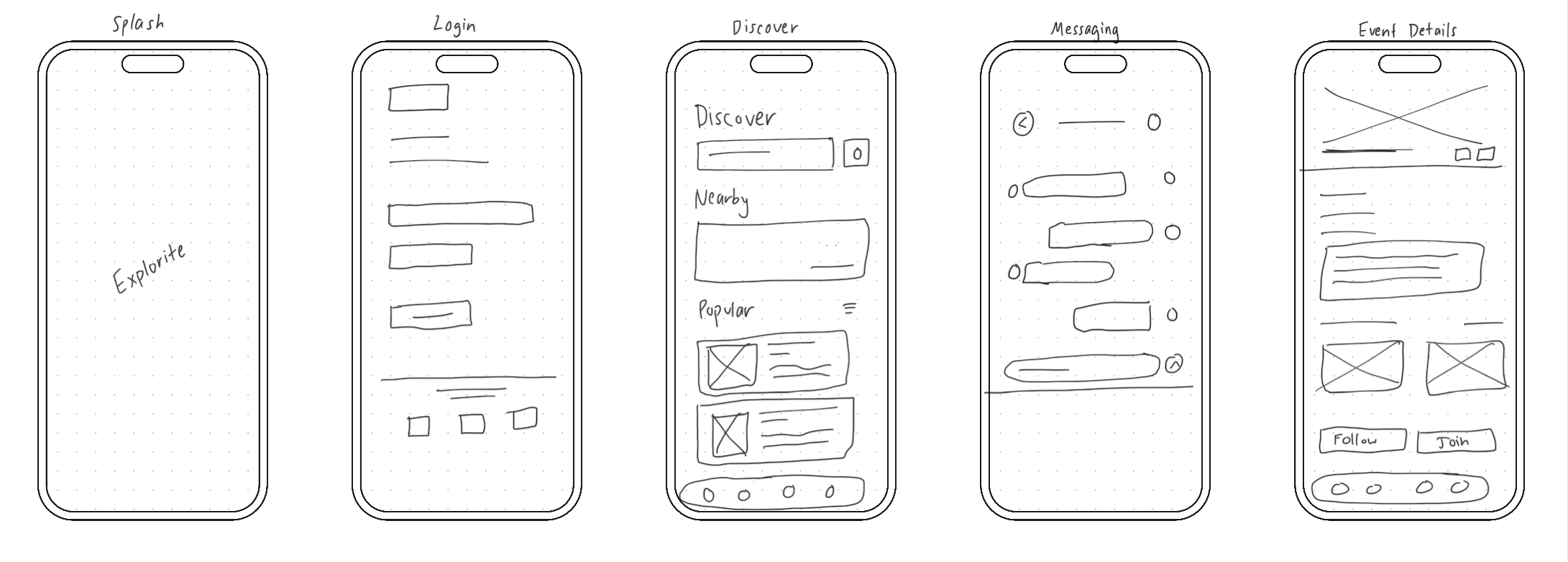
Sketches
lorem ipsum
Lo-fi Wireframe
Once my sketches were complete, I wanted to bring them to the digital space to observe the scaling, hierarchy, and type. I mainly focused on the fluidity from screen to screen and how users navigated through it by using a simple design language and well-known icons.
Hi-fi Wireframe
Once all the details and planning was complete, I began finalizing the design layout in Figma. I explored different color options and grids while designing which took up a bulk of my time.
ReFlection
Thoughts
As this was my first completed UI/UX design project, I stumbled and struggled many times throughout the procedure while deciding how to overcome problems, maneuver around deadline changes, and deciding which tools to use. I realized that with the abundance of steps involved, I have to determine which ones will work best for the current situation and not try to employ them all at once.
Furthermore, the entire process took me longer than it should have since I allowed myself to jump between sections to revise tasks. Although it is commonly known that design involves many revisions, I believe that I more so indecisive when choosing what features to add, colors to use, etc.
Personal Critiques
Given more time on this project, I would further develop the user journey map regarding the minor details and potential missteps. The steps were too general hence when it came to designing, I struggled with choosing the specific buttons and text boxes.
I would have also liked to incorporate more iconography and graphics to lean into the brand identity of serenity. Although the screens are mostly negative space, adding more colors and animations could also improve the visuals.
Learnings
Use grids before you start the design to ensure consistency
Organize your assets in the layers panel to avoid confusion
Utilizing components for animations, drop shadows and accent colors to highlight key elements
Line spacing, corner radius, and text size should be systematically determined to reduce decision fatigue
Utilize plug ins for iconography, saves time searching for a consistent set
Prioritization is key, know what you want to work on before you start otherwise you start jumping around (at least for me)
Finding assets and images to match the brand is difficult


