Project 1
Sereno
Overview
Sereno is a thought and emotion tracking app designed to monitor one’s wellbeing. Users would use this app to record their response to a certain event or mindset.
The goal is to create a safe and cozy interface that will gain the trust of users to share their thoughts and emotions.
Compared to other emotions tracking platform, Sereno aims to reduce clutter and avoid confusion by simplifying the user flow such as the sign up process and demonstrating the first steps necessary to recording one’s thoughts.
Problem context
In today’s modern age, we often neglect our personal well-being for work, socializing, and/or other responsibilities.
By spending just 1-5 minutes everyday to record one’s thoughts and emotions, we can reinforce better habits and identify patterns in our lives that add or take away from our mental and emotional health.
Role
UX Research
UX Designer
UI Designer
Timeline
June - September 2024
Audience
Young adults (18-26)
Business owners
Corporate employees
Tools
Figma, Miro
IDeation
Interviews
I started off by dividing my interview participants into two categories: those with previous thoughts recording experience and those with no prior experience. By doing so, I’m able to compare the differences between my target audience and people who could benefit from this activity.
It is also important to note that interview participants were of different gender, age, and education level. The interview was conducted through 1:1 text messages to allow more accurate documentation, although an in-person call via Zoom or FaceTime would have been preferred to receive more organic answers.
Group a:
What are some ways you’ve used to recorded your thoughts?
What is your preferred method of recording your thoughts (e.g., diaries, voice journals, scrapbooking)?
What are the pros and cons of using that method?
How often do you record their thoughts?
How does recording these thoughts impact your mental health?
What methods or features do you feel would encourage you to write down your thoughts more often?
What are some challenges you face when attempting to record your thoughts and emotions regularly?
Group B:
What is preventing you from recording your thoughts?
What are some reasons you think recording your thoughts might be helpful?
What are some ways you typically manage your thoughts and emotions?
Have you tried recording your thoughts in the past?
What methods did you user and how was your experience?
Research

How might we (HMW) statements
Creating how might we statements allowed me to narrow down my time towards generating solutions for specific tasks that I want users to complete
HMW create a satisfying and emotional experience for users to share their thoughts in a healthy way?
HMW make it easier to reinforce emotion/thought tracking by offering different recording methods?
HMW generate an intuitive interface that encourages users to record their thoughts more often?
HMW accurately depict user emotions in a way that defines how they actually feel?
Results
After conducting interviews, it appears that many participants would like to keep track of their thoughts and emotions more effectively however they often forget to do so due to busy schedules and lack of habit.
Furthermore, all participants agreed that tracking their thoughts and emotions would overall lead to better mental health and contribute to a more positive outlook on their living style.
As for pain points, some participants mentioned being unsure of what to write and the inconvenience of keeping a physical journal with them while still wanting an analog experience
User Stories
Utilizing data from the interviews, a list of statements were compiled to serve as the guiding principles for the design process and reinforce the problem statement. These statements include:
As a user, I want to make an account as efficiently as possible
As a user, I want to create a thought entry
As a user, I want to be able to easily access
my written thought and emotions
As a user, I want to be reminded of when I should track my thoughts and emotions
User Journey
Visualizing the user flow from screen to screen allows us to determine what necessary steps are needed to completing a specific task. In this case, we are observing the steps from the sign up page to the first thought recording moment then accessing those entries.

Design
Sketches
Now that the I know some of the user pain points and features users would like, I started sketching out ideas for what the solution might look like. My goal was to simplify the process and use iconography to create a minimal and accessible design language.

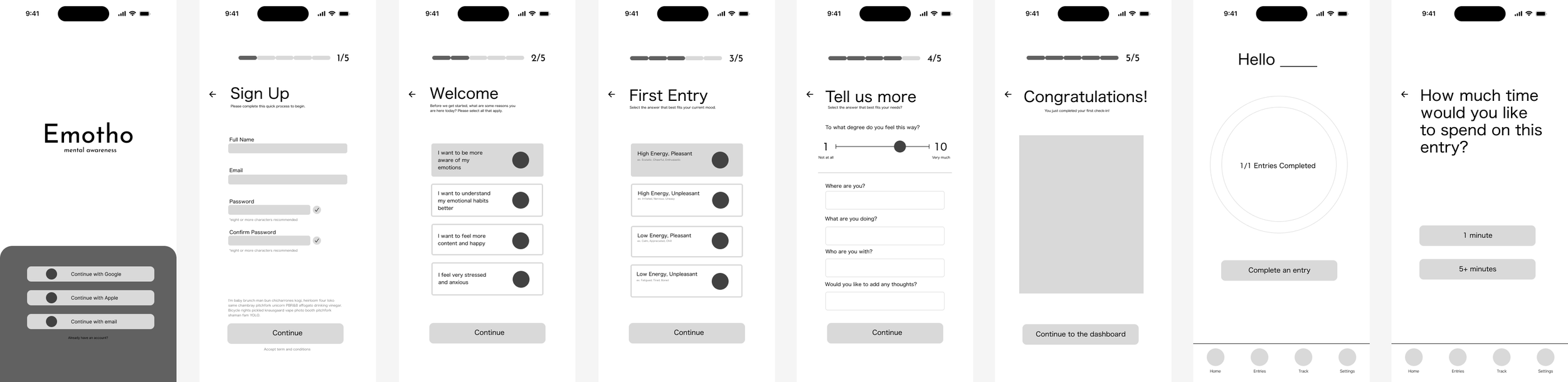
Lo-fi Wireframe
Once my sketches were complete, I wanted to bring them to the digital space to observe the scaling, hierarchy, and type. I mainly focused on the fluidity from screen to screen and how users navigated through it by using a simple design language and well-known icons.
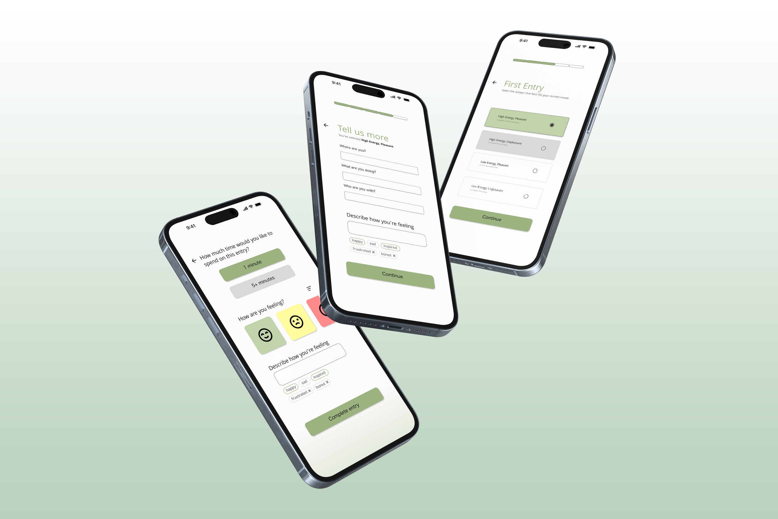
Hi-fi Wireframe
Once all the details and planning was complete, I began finalizing the design layout in Figma. I explored different color options and grids while designing which took up a bulk of my time.

ReFlection
Thoughts
As this was my first completed UI/UX design project, I stumbled and struggled many times throughout the procedure while deciding how to overcome problems, maneuver around deadline changes, and deciding which tools to use. I realized that with the abundance of steps involved, I have to determine which ones will work best for the current situation and not try to employ them all at once.
Furthermore, the entire process took me longer than it should have since I allowed myself to jump between sections to revise tasks. Although it is commonly known that design involves many revisions, I believe that I more so indecisive when choosing what features to add, colors to use, etc.
Personal Critiques
Given more time on this project, I would further develop the user journey map regarding the minor details and potential missteps. The steps were too general hence when it came to designing, I struggled with choosing the specific buttons and text boxes.
I would have also liked to incorporate more iconography and graphics to lean into the brand identity of serenity. Although the screens are mostly negative space, adding more colors and animations could also improve the visuals.
Learnings
Use grids before you start the design to ensure consistency
Organize your assets in the layers panel to avoid confusion
Utilizing components for animations, drop shadows and accent colors to highlight key elements
Line spacing, corner radius, and text size should be systematically determined to reduce decision fatigue
Utilize plug ins for iconography, saves time searching for a consistent set
Prioritization is key, know what you want to work on before you start otherwise you start jumping around (at least for me)
Finding assets and images to match the brand is difficult